Blog
What Colours Should I Use In A Contemporary Stair Design?
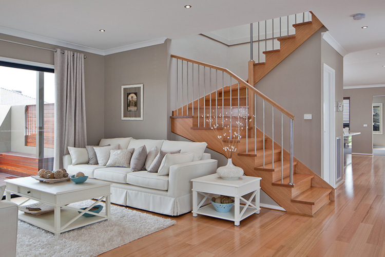
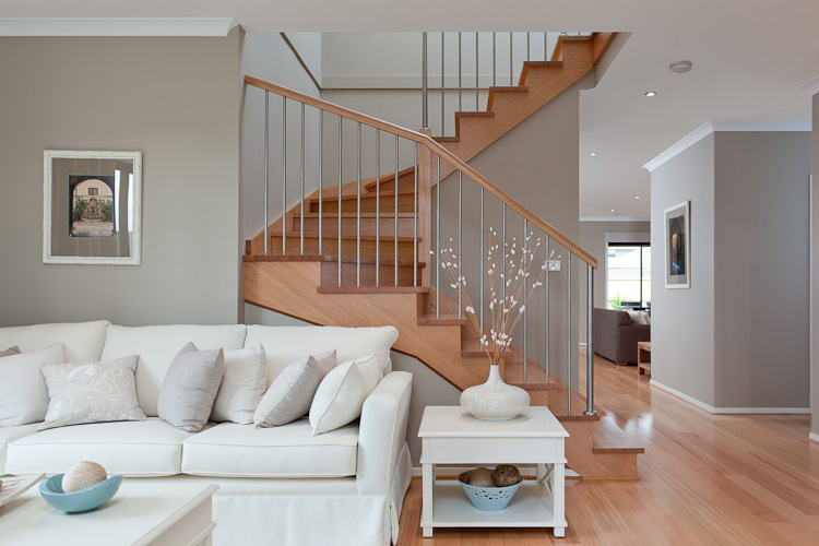
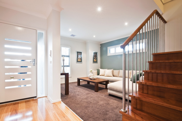
If you have opted for a contemporary stair design for your home, it’s likely that you’ll want a more modern colour scheme to match. This will ensure that the stairs are the perfect complement for your existing décor. This is, however, one area that people struggle with, as they aren’t sure what sort of colour palette is considered contemporary. We’ve discussed this further here.
Neutrals
You will actually find that a lot of contemporary colour palettes are filled with neutral colours. These include blacks, whites and greys. Depending on the look you’re going for, neutrals can be quite dark (think pitch black) or they can be quite light (think off white). These colours often form the basis or the background of the palette.
Earthy
You might also find that a lot of earthy colours, such as greens and browns, are used extensively throughout contemporary design. There are varying shades of brown and green to choose from, some dark and others like. Like neutrals, they tend to form the basis or the background of the palette so that the other colours used really stand out.
Light
Some palettes seem to be entirely made up of light colours, from whites and greys to pastel blues and greens. These sorts of colours blend quite well with neutrals and earthy tones – they tend to give the space a feeling of freshness and clarity. If you have a smaller stairwell with little natural light, this is definitely the palette to adopt.
Dark
Other palettes seem to be entirely made up of dark colours, from blacks and greys through to navy blues and chocolate browns. Again, these sorts of colours blend quite well with neutrals and earthy tones – they give the space a rich and luxurious feeling. If you have an open stairwell, a darker palette will probably show it off the best.
Pops
To really add some interest to your stairs, you could add a pop of colour to the palette. Purples, dark pinks, lime greens, deep reds, oranges, aquas and sky blues are popular choices. These sorts of colours will blend well with the rest of your palette, but will draw the eye. Just ensure that you don’t go overboard – pops need to be subtle.
Whilst you should certainly consider what sort of colours are being used elsewhere in your décor, we hope that the information provided above has enabled you to choose a colour palette for your contemporary stair design. At Gowling Stairs, we can provide you with a design that complements your contemporary home perfectly – you just need to pick the colours.